
Project Goal
Optimize the digital experience of the Sabadell bank through the redesign of the web interface and mobile app, using User Centered Design techniques.
Project Stages
Analysis and Research
Heuristic Evaluation
Jacob Nielsen's 10 heuristic principles adapted by Luis Rodríguez Baena to the heuristic evaluation of the Web were analyzed. Each of them is divided into more specific observable aspects.
Each problem has been identified by observing the non-compliance with Jakob Nielsen's 10 heuristics and evaluated by means of a Severity Ranking. In this ranking the problemare rated from 0 to 4, with 4 being a catastrophic problem, considering the frequency, impact, and persistence of the problem.
Level 0: Not a usability issue.
Level 1: Cosmetic issue. Does not affect usability and is more of an aesthetic concern.
Level 2: Minor issue. Does not significantly impact usability but may pose a minor obstacle for some users.
Level 3: Major issue. Significantly affects usability and may be an obstacle for many users.
Level 4: Critical issue. Prevents users from completing important tasks and poses a major usability obstacle.
Strengths:
It meets many usability principles, such as visibility of system status and error prevention.
Effectively applies key principles like user control and freedom and help and documentation, contributing to a positive user experience.
Areas for Improvement:
Visibility of system status: Improve clear indicators of the user's location.
Flexibility and efficiency of use: Provide more customization options and advanced search features.
Aesthetic and accessibility adjustments: Improve font size and readability in certain areas.
The bank offers an overall positive experience, but addressing key areas for improvement can further enhance usability, accessibility, and maintain a competitive position in the online banking market.
Benchmarking
The practices and features of the 5 highest-performing traditional banks in mobile, according to the MPIx (Mobile Performance Index) conducted by Smartme Analytics (Smartme Analytics, 2024), have been compared. Among them, Sabadell ranks number 5, so Bankinter was also included as another traditional entity whose app stands out as one of the most comprehensive in the market. A total of six banking apps were analyzed: BBVA, CaixaBank, Santander, ING, Bankinter, and Sabadel.
Once the study objects in the competitive context were selected (13 Items to evaluate), a superficial approach was adopted, combining direct exploration with secondary source exploration. Thanks to the information gathered from official websites and app stores, strengths, weaknesses, and opportunities for improvement were identified, which will aid in the redesign process. The score is from 0 to 5.
Examples items to evaluate
Biometric login
General search engine
Smooth navigation
App Customization
Own virtual assistant
TOTAL
5
General conclusions
The quantitative evaluation shows that the apps with the best user experience are those of Banco Santander and BBVA. However, BBVA users suggest reducing the amount of advertising, as they feel it interferes with navigation. In third place is CaixaBank Now, which stands out for its experience, features, and navigation, although an improvement could be adding a general search function to help users easily find information related to transactions, movements, or frequently asked questions.
Users particularly value time savings in banking operations, which highlights the need for ING, Sabadell, and Bankinter to improve their performance and navigation, as these are the aspects causing dissatisfaction.
5
5
5
5
5
0
0
5
0
0
0
4
5
5
3
3
2
4
4
5
3
3
2
5
5
0
0
0
0
54
53
55
40
39
29

Interview
To gain an in-depth understanding of the needs, preferences, habits, and frustrations of potential users of Banco Sabadell's website and app, 7 interviews were conducted using a mixed approach (face-to-face and videoconference).
I conducted semi-structured interviews, which are characterized by following a script designed to gather information or insights about specific topics relevant to the project.
Participants were chosen through traditional quota sampling based on their relationship with the product.
The criteria used to determine participant eligibility were as follows:
Users in the process of digital literacy.
Users familiar with using the internet and mobile applications.
Users whose consumption habits include having performed at least one banking operation in the last month.
Expert users or heavy users.
Findings
Key insights regarding user experience with Banco Sabadell's online banking include:
Branch Visits: Most users only visit branches to resolve specific issues, preferring to handle their transactions online. This underscores the importance of a robust digital service.
Scheduling Issues: Problems such as long wait times and limited service hours were identified. A digital queue system is suggested as a potential solution.
Device Preferences: Many users prefer the mobile app for its convenience, although they find the desktop version more suitable for complex operations. Additionally, users expressed a desire to perform all tasks on the desktop version due to growing concerns about cybersecurity threats.
Transfer Options and Bizum Visibility: The options for transfers and Bizum are not easily visible and lack clear information.
Survey
The survey included a total of 103 participants, selecting individuals over 18 years old who had used the app or website of a banking entity in the past 6 months. The objective was to gather detailed information about the user experience on these platforms.
The survey consisted of 15 questions organized into 8 sections, and the findings provided interesting insights into users' experiences with digital banking.
Key Findings:
Demographics: Most respondents are between 26 and 50 years old and have a university education, indicating a strong presence of online banking among young and middle-aged adults.
Frequency of Use: Many participants use these services several times a week, highlighting their importance in daily financial activities.
Banking Preferences: Preferences range from traditional institutions to newer options like Revolut, reflecting competition in the market.
General Experience: While the overall experience is positive, respondents identified areas for improvement, signaling ongoing challenges in platform usability.
Security and Accessibility: Most users feel secure using online banking, but some expressed concerns about accessibility, emphasizing the need to uphold high standards.
User Suggestions: Participants recommended personalization tools and improvements in navigation and customer service to enhance their experience.
These insights underline the significance of digital banking in users’ daily lives while identifying opportunities for further optimization.

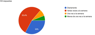
How often do you use online banking?
Design
Personae and Scenarios
Based on the data obtained in the research phase, patterns of behavior, needs, objectives and common characteristics among users were identified. This allowed us to define three distinct archetypes. From these archetypes, three personae and three specific scenarios were developed.
The defined archetypes are as follows:
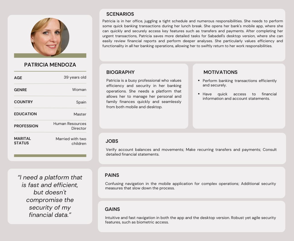
The Efficient Executive
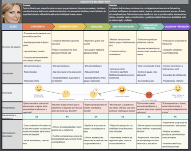
This archetype represents busy professionals like Patricia Mendoza, a Human Resources Director who needs to manage her finances quickly and securely. Patricia values efficiency and functionality in banking operations. She uses the mobile app for quick transactions and the desktop version for more detailed tasks. She seeks a banking platform with intuitive and efficient navigation, as well as robust yet seamless security features that do not disrupt her workflow.
The Tech-Savvy Entrepreneur
This archetype represents young entrepreneurs like Jorge Fernández, who manages both personal and business finances. Jorge primarily uses online banking on his mobile device for quick operations but prefers the desktop version for more complex tasks. He values advanced customization options and clear, accessible navigation that allows him to perform operations efficiently and flexibly. Jorge seeks a digital banking experience that offers the robustness and versatility needed for his dynamic and demanding lifestyle.
The Confident Digital User
This archetype represents digital natives like María López, a freelance graphic designer who uses the mobile app for all her daily transactions. María values convenience and accessibility in her banking experience. She needs an easy-to-use app that allows her to manage her income and perform transactions quickly. Additionally, security features must be robust without compromising ease of use. María seeks smooth navigation and intuitive menus that make her banking experience as efficient and stress-free as possible.
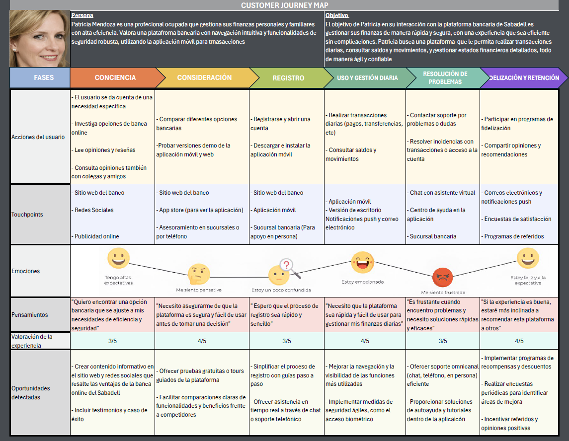
Customer Journey Map
The customer journey map was developed from a holistic perspective, aiming to provide a detailed description of how the client experiences their relationship with Sabadell. This tool is used to diagnose the customer experience, drive innovation in this area, and set priorities in situations with limited resources, thereby identifying the key areas that require focus.
Sitemap
An analysis was conducted on the current sitemap of Banco Sabadell’s website, focusing on the online banking experience for individual customers. The existing information architecture, including the hierarchical structure, main and secondary navigation, and key user flows such as account access, help, and product information, was evaluated.
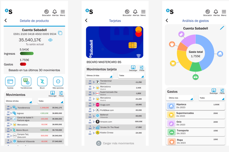
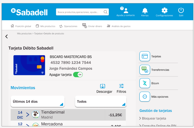
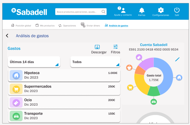
Based on this assessment, a new sitemap was proposed following a mobile-first approach, simplifying navigation and reorganizing categories to enhance the user experience. The new main menu includes: Global Overview, My Products, Transactions, Send Money, and Expense Analysis. Frequent-use features were prioritized for visibility, improving clarity, accessibility, and ease of use. This redesign is currently in an early stage and will be further developed in future iterations.

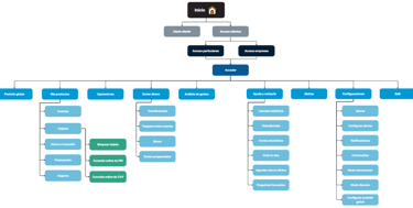
Sabadell sitemap preliminary proposal
Prototype
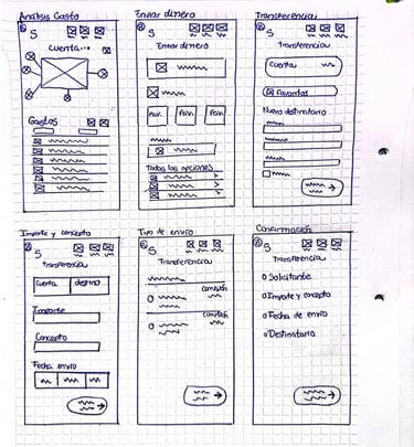
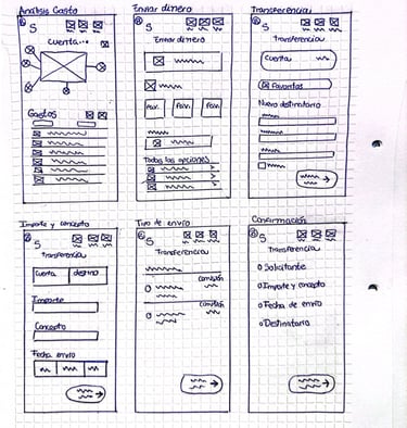
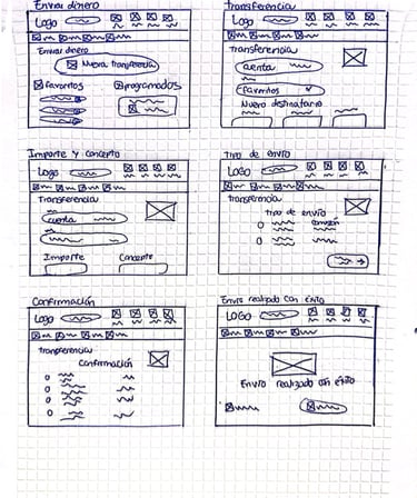
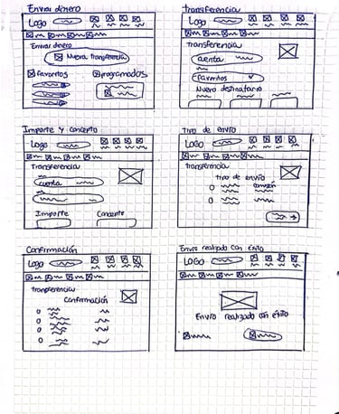
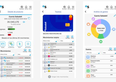
In this phase of the design process, low and medium-high fidelity prototypes have been developed to ensure the optimization of the user experience and efficient functionality.
At an early stage of the project, the low-fidelity prototype has been developed, first in the form of sketches and then in basic wireframes representing the structure and layout of the interface elements.


Some highlights of the Redesign
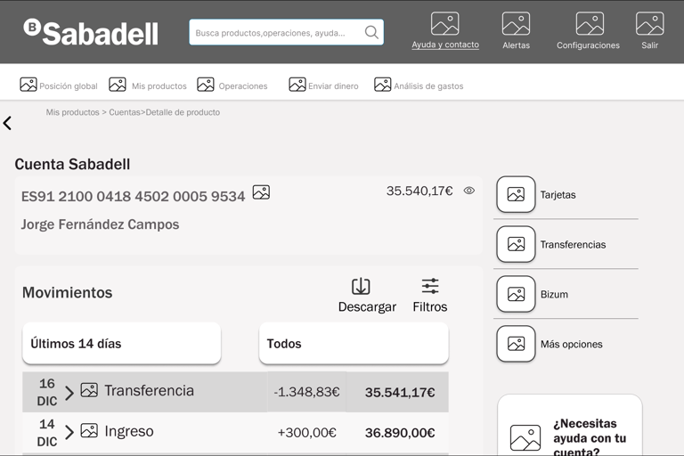
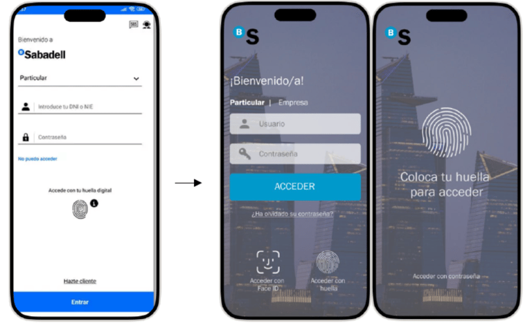
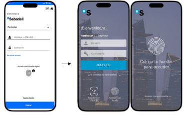
Access to online banking has been unified into a single login page, and biometric access with facial recognition has been implemented to enhance user security.
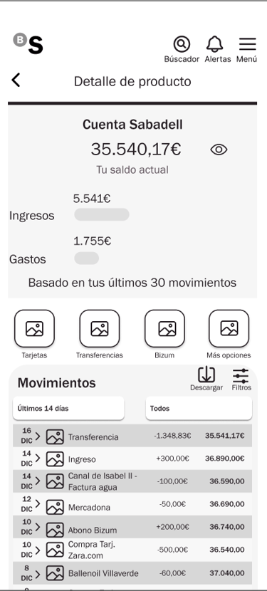
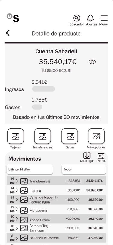
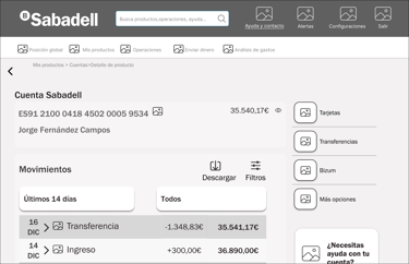
The new prototype features a more intuitive navigation menu and improved global positioning, enhancing accessibility and user experience. Additionally, a "discreet mode" option has been introduced, allowing users to hide their current balance while using their account.
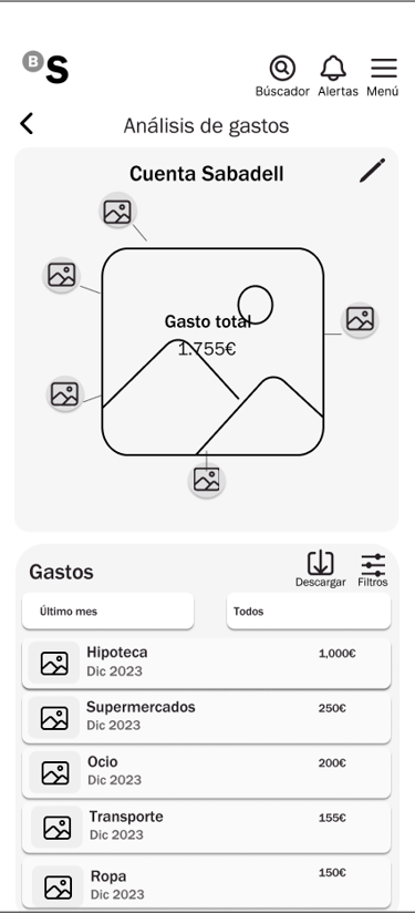
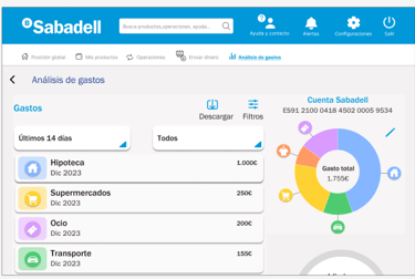
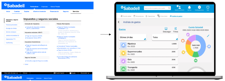
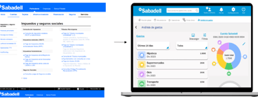
The expense analysis section has been redesigned to provide users with a clearer and more detailed view of their finances, featuring improved charts and more accurate categorizations.
The transfers interface has been simplified and optimized, allowing users to make transfers more quickly and easily, with options to schedule them and mark contacts as “favorites.” The Bizum functionality has been seamlessly integrated into the app, featuring a more user-friendly and accessible interface.
take a look at the prototypes
UX Evaluation
User Testing
This test aims to identify and assess potential usability issues through user testing.
Participants were selected using traditional quota sampling, based on their relationship with the product. The eligibility criteria used to determine the participants were as follows:
Basic Description:
Adults aged 18 to 60 who are frequent users of digital banking services and online transactions.
Individuals interested in using banking services through mobile applications and web platforms.
Skills:
Users familiar with using the internet and mobile applications.
Consumption Habits:
All participants must have completed at least one online banking transaction in the past month.
They should regularly use digital banking services for various financial operations.
Users completed a total of four tasks. For each task, they were not given key information such as the starting point, a detailed task description, the objective completion criteria, or a time limit. They were only provided with a general scenario to guide them through the task.
Main conclusions of the usability test
The tasks performed were analyzed to evaluate the efficiency, effectiveness, and satisfaction of the user when interacting with the platform. Critical issues impacting the user experience were identified, highlighting both successful areas and aspects that require significant improvements. The results offer a comprehensive view of the platform's performance and provide a solid foundation for future optimizations.
final conclusions
Navigation and Usability of the Menu:
It is crucial to improve the clarity and organization of the navigation menu. Including more intuitive labels and possibly a tutorial or an initial guide for new users could reduce confusion and increase efficiency.
Transaction Inquiry:
Simplifying access to transaction inquiries, possibly by merging or clearly differentiating the "accounts" and "cards" options, could significantly improve the user experience.
Access to Live Chat:
Increasing the visibility of access to live chat, perhaps by adding a prominent button on the main page or in an easily accessible section, could help users find this feature more quickly.
Calendar Interface:
Expanding the size of the calendar or improving its design to facilitate date selection is recommended. This could include using a more responsive design that adjusts appropriately across different devices.
Critical Error Management:
Resolving the issue with the "continue" button in the Bizum process is a priority, as it blocks the completion of a crucial task. Implementing a more rigorous testing system before launch could help identify and fix these errors before they affect users.